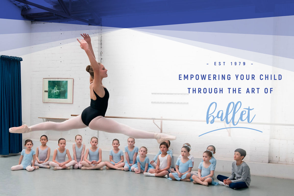
We were fortunate to be a part of the rebranding and website redevelopment of Academy Ballet – one of Sydney’s leading ballet schools in Moore Park.
Sinead contacted us looking for a fresh new look for both her branding and website.
As many small business owners do in their initial start-up phases, Sinead had built her first website on Wix. It did the job for the early years.
However, as her business grew, so did the need for her website to match the quality and professionalism of her ballet classes.
A new logo look keeping ties to the old

Sinead particularly loved her A & B that were integral in her original logo. The brief was to keep elements of the old look but elevate the branding with a modern feel.
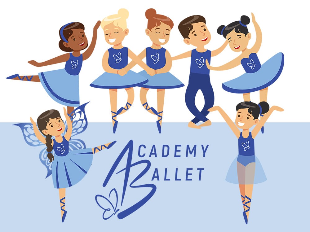
We adapted the logo with a more modern font and added the little butterfly to encapsulate her business tagline ‘From caterpillar to butterfly’ helping young dancers grow and evolve into beautiful humans through the love of ballet.
Sinead went on to update her branding across the ballet studio and promotional materials. The new logo also provided the baseline to the look and feel of her new website.
In the branding phase, we also created a suite of new Academy Ballet characters to be used across the website and the Academy Ballet’s social promotions. We had to stop ourselves from creating more and more of these gorgeous characters!
From Wix to WordPress
One of the greatest moves in web design is the move from a DIY platform like Wix, to WordPress.
Sinead was seeking a higher-end design with greater flexibility – especially when it came to her extensive Academy timetable. For service-based activity providers, timetables are both one of the most important elements for users to navigate, as well as one of the most comprehensive. Finding a way to present them clearly and responsively is so important.
We designed the Academy timetable to be both pleasant to the eye as well as simple to navigate, and most importantly, responsive on all devices.
It was important to Sinead and her team that the levels of classes were clear to parents booking in their children. A lot of admin time was previously sent fielding calls from parents unsure what class to book their child into.
One of the great aims of any site is to reduce any unnecessary admin time when the website can provide simple answers. We separated the classes clearly into Minis, School and Adult classes, each with its own landing page and links to find the appropriate class.
Pulling it all together
Over the course of several months, we worked with Sinead to:
- Update her new logo and develop comprehensive brand guidelines
- Developed key selling proposition and brand messaging
- Keyword research and keyword planning
- New copy for her website
- Design and development of new WordPress website
- Creation of social media templates for use on all platforms
Working with Sinead was an absolute delight and we couldn’t be happier with the results she has achieved.
A word from Sinead:
“My new website is intuitive for my existing customers and new customers. Sometimes we get people calling to chat to us but they have no actual questions because all the info was so easy to find on our site.
Working with Vanessa and her team was a dream, they are so organised & attentive to detail.”
If you would like to chat with us about how we can help elevate your business, give Vanessa a call today or complete our contact form to get started.


